
Map of thumb stretch ranges when using a cell phone
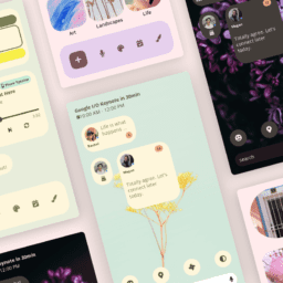
Design and positioning of app menus
The way we use our cell phones affects our brains. A study found that daily cell phone users have a larger somatosensory cortex. This is the area of the brain that controls the thumbs.
Further studies have found that most users use their phones with one hand. When they hold their phone, they will use their right or left hand with the thumb used to interact with the screen. The thumb is like the user's mouse but with limitations.
Small screens versus large screens
The upper areas become more difficult to reach as mobile phones have larger screens. Phones with a large screen (more than 5 inches) have less accessibility in the top area of the phone (less than 5 inches).
Large screen phones have poor accessibility in the corner opposite the user's thumb. Whether it is in the left or right corner depends on which hand the user is holding the phone. If users hold the phone with their left hand, their thumb will have trouble reaching the right corner. If they hold the phone in their right hand, their thumb will have trouble reaching the left corner.
On the other hand, phones with a small screen have a good ability to reach the bottom corner. The reason for this is that the device is thin enough for the thumb to reach the corner.
The thumb is the mouse
On desktop devices, users use a mouse to interact with the screen. They can move the mouse to navigation menus easily. This is because the mouse does not restrict their hand movement. But when users hold a cell phone, their thumb has a limited range of motion. There are certain areas of the screen that cannot be reached. These areas will vary based on the hand they use to hold their phone and the phone's screen size.
When you place a menu in a location that is hard to reach with the thumb, your users have to reposition the phone in their palm to move the thumb closer to the target or they have to use their other hand to interact with that area. This is extra work that can make navigation more difficult and slow down user activity.

Map of thumb stretch ranges comparing large and small screens
Rule of thumb
Experts UI UX Can't change the way users hold their mobile phone but they can change the location of the navigation menu. Most designers place the navigation menu at the top of the screen. While a menu at the top of the screen is legitimate on your computer desktop, the opposite is true when it comes to the mobile phone.
The most difficult areas to reach with the thumb are at the top of the screen. Placing your menu at the top will make it difficult for users to navigate the app. Menus are features with a high frequency of use and therefore it is necessary to place the menu within reach, which will allow users to complete their tasks much faster.
Studies have found that "areas within reach of the thumb were the fastest and most convenient to use." In other words, the closer the target is to the thumb, the more accessible, more comfortable, and faster it is to produce the touch. The area that is easiest for the thumb to reach is the bottom of the screen. This is where your menu should be located.


Value in location
The bottom position of the menu allows users to tap the hamburger icon and select an option much faster. Placing the menu at the top forces users to reposition their phone or use their other hand to navigate. This requires physical maneuvering and slows down mission time.
The menu will open from the bottom when users tap the thumb hamburger icon. When the menu options are closer to the bottom, they are within reach of the thumb, whereas when the menu options are located at the top of the screen, they are out of the thumb.
In a traditional menu you would place high priority options at the top (top). But in the bottom menu the order is reversed - high priority options will be placed at the bottom. The new menu hierarchy will start with lowest priority options at the top and higher priority options at the bottom.
The sweet spot of the thumb
Different app users have different preferences when using their thumb for navigation, studies have found a small area where a user does not have to stretch or bend their thumb. They happened to this point "the sweet spot". Placing your menu in the bottom center of the phone means being accessible in the "sweet spot". This is the most accessible place for left and right handed users, and for small and large screens.
The "sweet spot" is handy for phones with larger screens. Small-screen phone users have almost no inaccessible corners, users may have to bend or stretch their thumbs to reach them, but most of the area is sufficiently accessible. As the big screen trend develops, the rule of thumb sweet spot becomes more critical to design and planning considerations. The ideal navigation for users is with as little thumb movement as possible. This mechanical efficiency will lead to task completion for the user.
Keep in mind that we are used to finding the navigation menu at the top, this was and still is the prevailing norm among application architects (especially on Android) and therefore opinions are divided on this issue, however it can be seen that opinion leaders and huge market educators such as Google (YouTube), Apple and others have begun to act in the direction and embed submenus. I assume that we will see a lot of change and new norms as a blanket standard in the next year or two, also in the operating systems.
The goal of the user experience (UX) designer is to make navigation on the mobile device as fast and smooth as possible. Using the law of "accessibility of the toe" and the "sweet spot" makes it possible to perform tasks faster and easier for the users. Even if you don't make the change after the fact, at least include it in your various considerations. The solution is simple and the profit is huge.