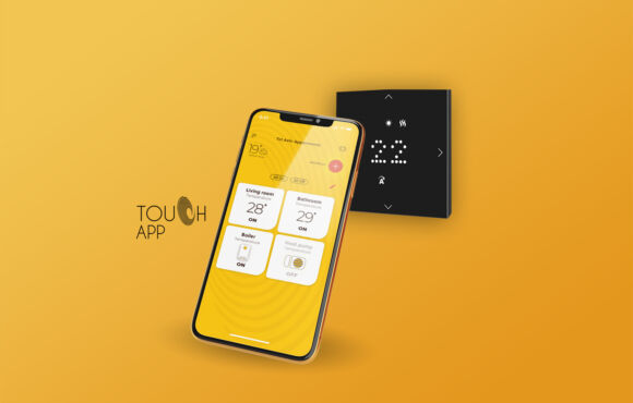
Syracuse User Experience and Autonomous Computing Design for Crane Operators
Did you think knowing how to drive a car was a complex task? So think again!
Being a crane operator on a construction site is a complex task. Limited field of vision, changing crane and load size, dynamic obstacles, electric wires, and restricted areas create an immediate and tangible danger at every moment of the crane's movement. Typically, operating a crane requires a lot of skill and several people who make the crane operation together in synchronization: an operator in the crane cabin, operating landmarks on the ground, and receiving the load.
An Israeli company named Syracuse, developed a sensor mechanism that sits on different points on the crane and through them, the three-dimensional area is scanned and enables the provision of proximity alerts, a safe route to the destination and in the future autonomous operation of the crane from point to point on the fastest and safest route.

The challenge - minimalism in the service of the operator
The crane cabin is flooded with control and movement devices, and in such a reality, every element added to this space must be clear, intuitive and easy for the operator. The motto is that when there is no problem, it is better not to know and when there is one, how do you attract the attention of the crane to understand what kind of problem exists quickly and in a simple and basic way.
Another challenge for thinking in product design was the ability to convey on a small 10-inch screen the three-dimensional maneuvering of the various tools on the construction site from the minimalist thinking that sometimes manifested this maneuvering in the need to solve
Lack of visual communication between the crane and the load and by maintaining areas and obstacles that are prohibited for movement.
The solution - pixelization of the work space, the inspiration - Minecraft
For those who know the immortal game Minecraft, the most obvious thing about the game experience is the choice of the design character that the architects of the game chose, which is turning complex color surfaces into pixels, thus reducing the existing visual load compared to other games. Although pixelization was made here to create a unique optical character of the game, this choice unintentionally created a "focus" in the game experience. It facilitated the processing of data in real time.
The use of basic geometric shapes to abstract features in the software/application creates a focus on the things that are really important in critical times, therefore you can see quite a few industrial solutions related to safety and the interface between man and machine (HMI), who use this visual solution.
The conversion of the structure of the construction site and the various cranes into minimal basic forms, a color contrast between the dynamic and static elements on the construction site and bright colors combined with animation in the event of minor and critical faults, created the required harmony as a basis for thinking about the user experience.

Break your head - how do you set a three-dimensional obstacle in a three-dimensional space full of events!
One of the challenging tasks in the project was giving the site manager the opportunity to determine a three-dimensional obstacle as a no-go area (for example: a kindergarten located on or adjacent to the construction site). My starting point was how the shape of the obstacle, the area of the obstacle at its base and the height of the obstacle can be determined in two steps in an intuitive and simple way for the user and through a touch screen.
The result: a two-step transition from a two-dimensional view to determine the area of the container and its shape to three-dimensional to determine the height of the obstacle in two short steps with the possibility of editing the obstacle and updating it in the three-dimensional space. The visual expression chosen to represent the process on top of the symbols that already appear on the map, is the choice of a neon bright color transparently in order not to hide the game tools.
In conclusion, When you play with the rules you set in terms of visibility and user experience and the various events you simulate to be successful, with the help of the rules you set to work well visually, you realize that you have a winning formula in your hand that works well in any condition. All you have to do is make "light adjustments" in order for the legality to work well even in extreme situations.
Not a small challenge, but no challenge cannot be solved with the help of going outside the box and an exciting story.
Additional projects
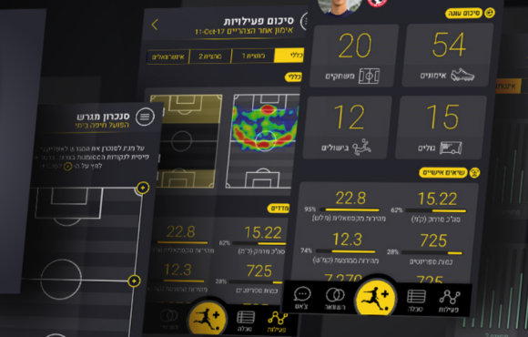
UX UI design and user experience for an application that provides full tracking capability for soccer players

Design and user experience for the EPG interface for Hot Altice cable TV
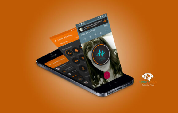
listen-app Design and user experience for a communication security application
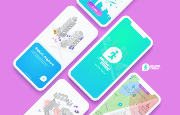
UX UI design and user experience for a pedestrian hazard alert app
Caspit - design and user experience XU UI for an Android-based clearing application
Designing an IOT application for a system to prevent children from forgetting in the car
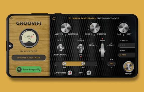
XU UI design and user experience for a professional application for deep filtering playlists from Spotify
Design and user experience for the call center system
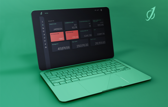
UX UI design and user experience for algo trading system
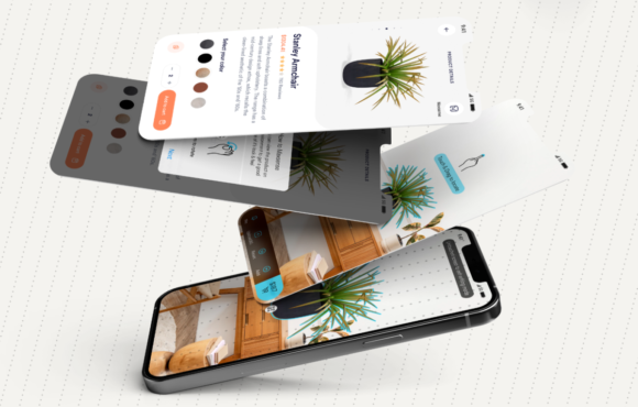
Design for a product display layer in an AR environment for e-commerce stores
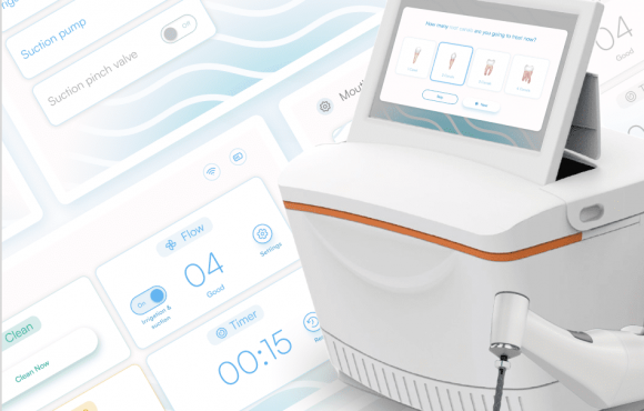
Interface design and user experience UX UI HMI for a technological device supporting doctors for a root canal treatment system
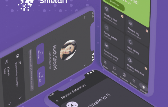
Design and user experience for a secure communication application for government and organizations